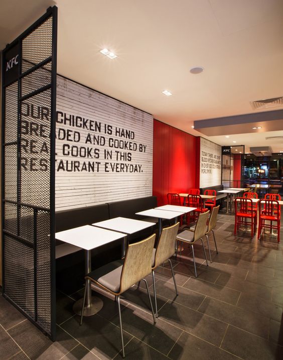
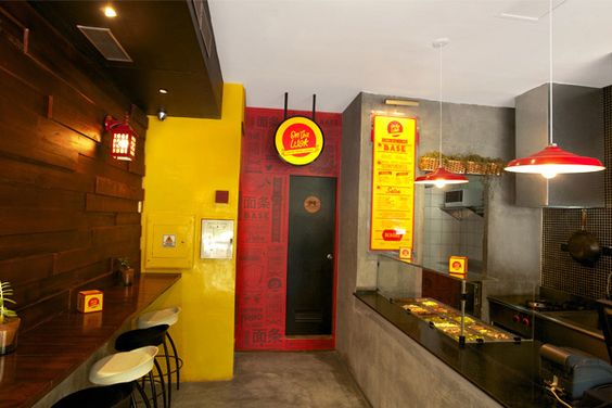
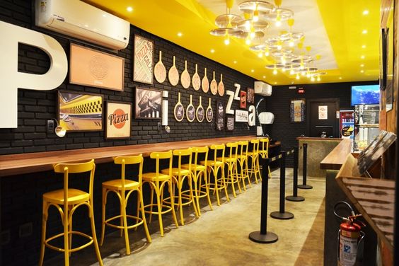
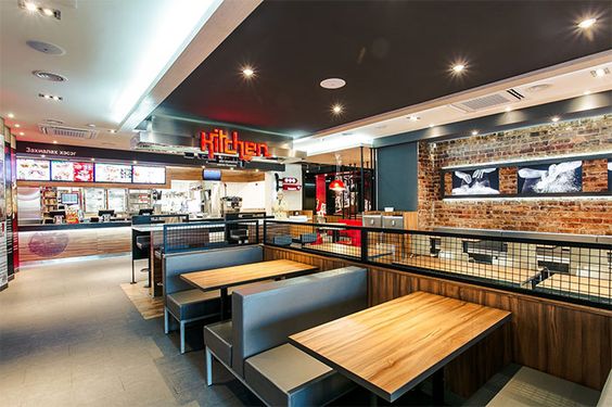
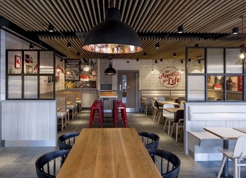
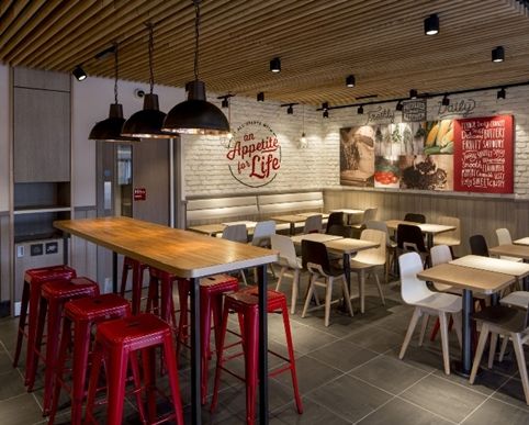
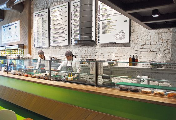
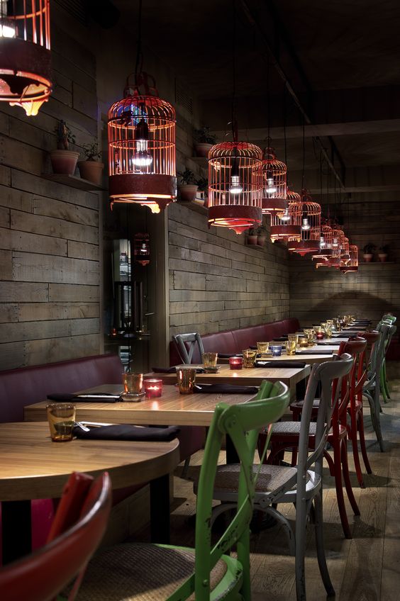
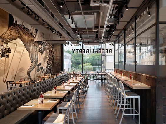
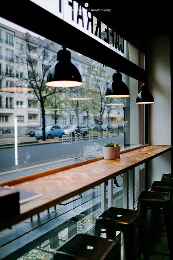
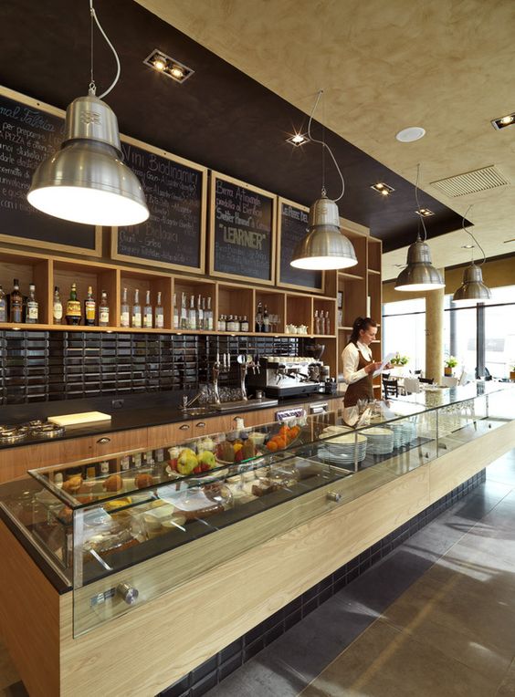
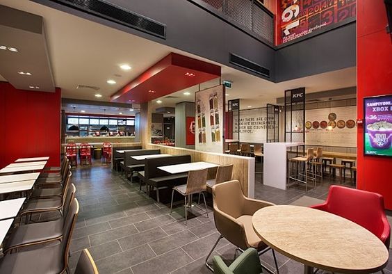
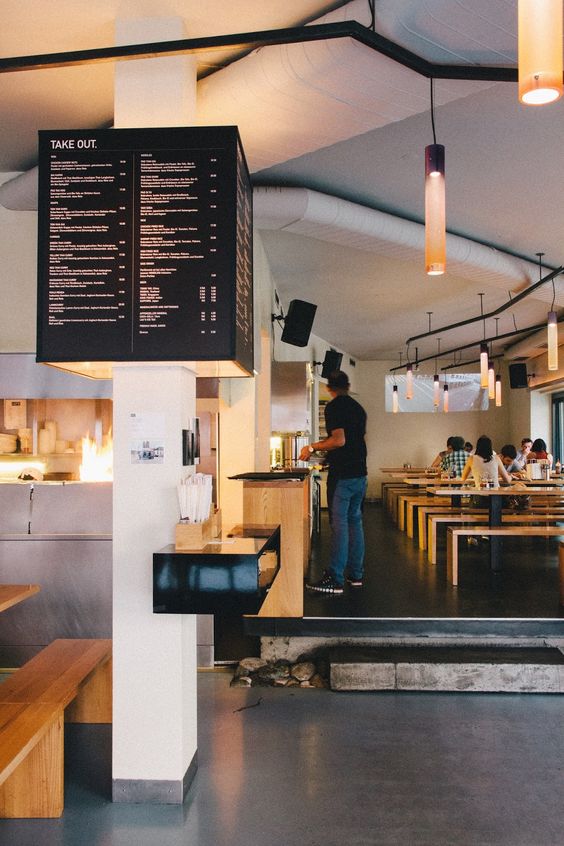
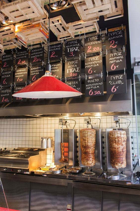
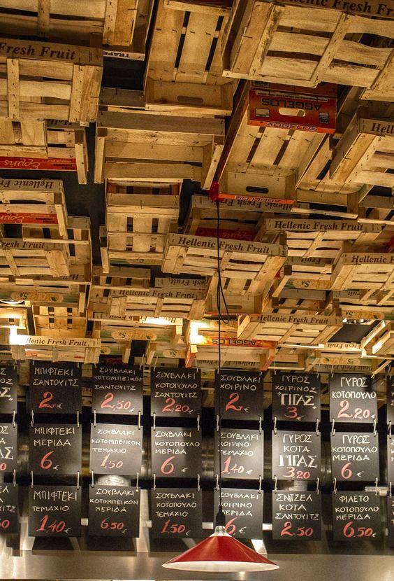
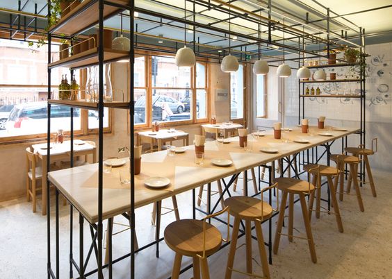
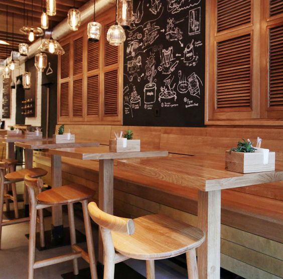
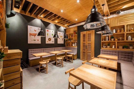
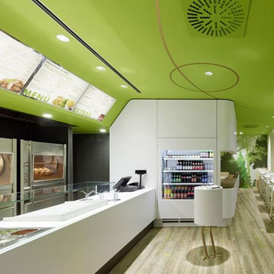
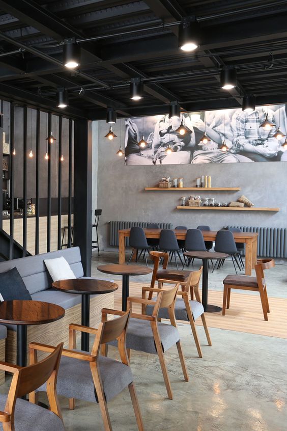
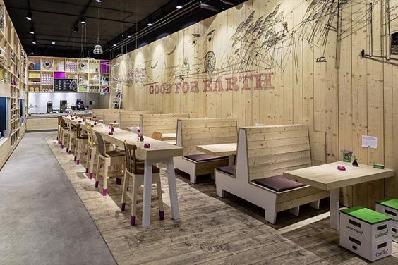
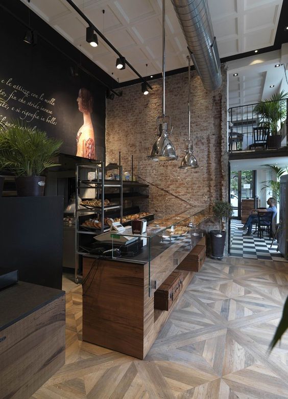
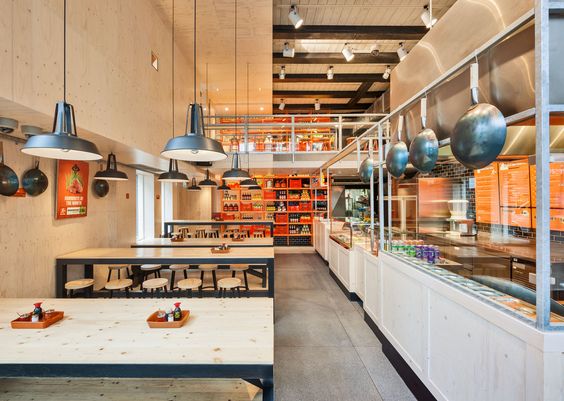
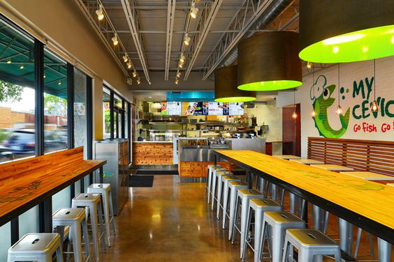
When you enter a fast food restaurant, we are sure that your focus on getting the food fast and then either eating it right there or going away to eat it elsewhere. What we mean is that fast food restaurant are about getting food that is served fast and often eaten on the run. While most fast food outlets have gotten a bad reputation due to the fact that they promote a culture of fast gratification without providing attention to nutrition and nourishment, that is not the point here. The point here is that fast food restaurants are an important feature in our lives, and they are here to stay with the fast and efficient service they provide. But have you ever thought about the way the interiors of the fast food restaurants are done up and what is the thought process that has gone into them. If you are actually thinking what thought process, think again. There is a lot of thought and planning that goes into the interiors of a fast food restaurant. It may not stay in your mind in the same as some remarkable and memorable restaurant interior designs but you retain more of an impression than you realize.
Yes, fast food restaurant interiors are done with a lot of thought and this works not only on ensuring that you feel good and comfortable being there but also gives you a distinctive image of the brand in your mind. They may even have borrowed a concept or two from cruise ship interiors that let you enjoy the nautical journey. While you are on this subject, you should also check out interesting and eclectic food court designs to keep you engaged as these will give you a deeper insight into how the decorations are done.
Here Are Some Interesting Points To Ponder When It Comes To The Interior Designs Of Fast Food Restaurants, Which You Can Learn Plenty From:
Space is maximized: The thing about fast food joints is that they are mostly located in larger malls or shopping centers, which means that they have to make the most of the space that they have. You can definitely learn a thing or two from studying the interiors of fast food restaurants about how to use space without making it too cramped to look at.
The signature is definite: Most of the fast food restaurants have chains running across the country if not across the world. This means that they need to have a color theme and signature items for décor that are easy to recognize. This is the way they literally brand their identity and brand across the minds of their customers. This is consistent but always with a small tweak or two of their own to fit the local area if it is required.
Family friendly and cute: Another common factor in most fast food joints is that the recognize and acknowledge that families are bound to love them especially the kids. They have used this factor to ensure that they are remembered by the children who then force their parents to visit time and again. In most instances, the décor is attractive and cute for the kids to play around in.
Ensures efficiency and speed: You have to remember that fast food restaurants about quick and efficient eating and not about gracious dining. If you really look closely at their interiors, you will realize that fast food restaurants have factored this in to ensure that though comfortable, the décor also encourages efficiency and speed to keep people happy but moving.

