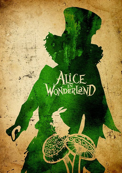
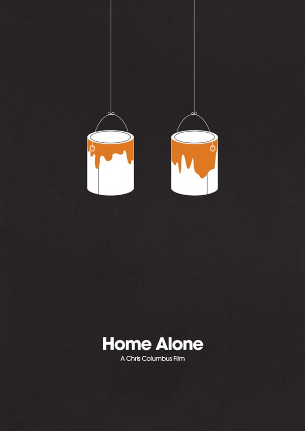
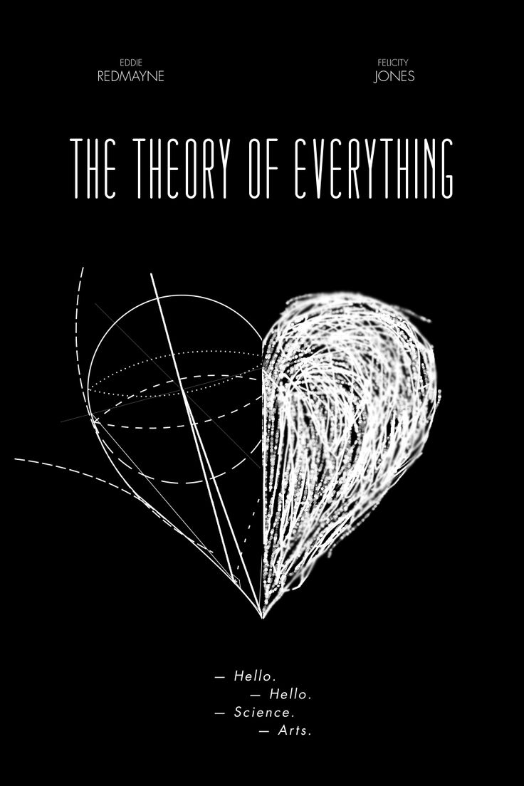
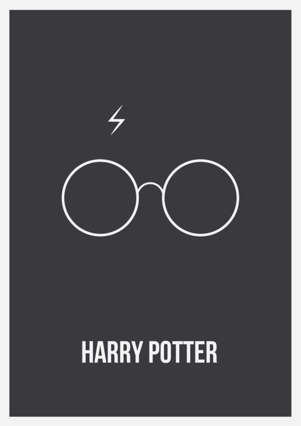
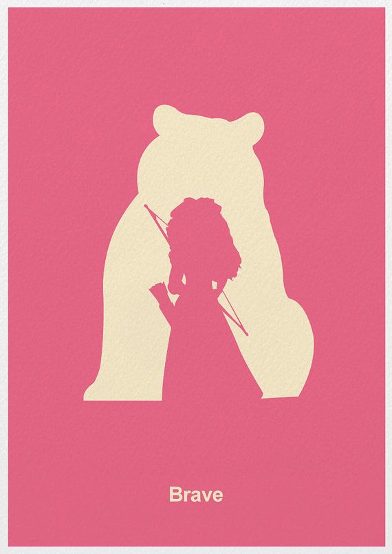
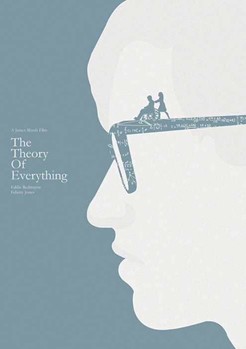
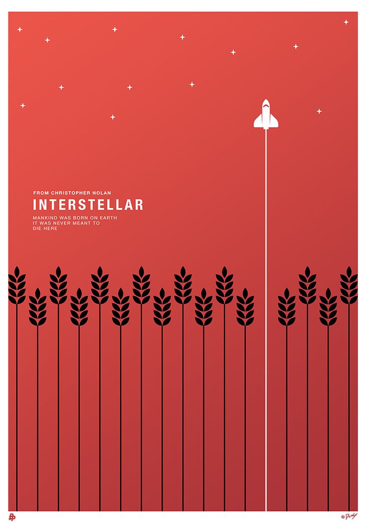
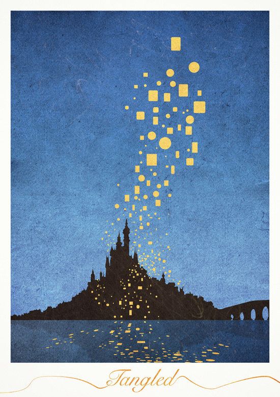
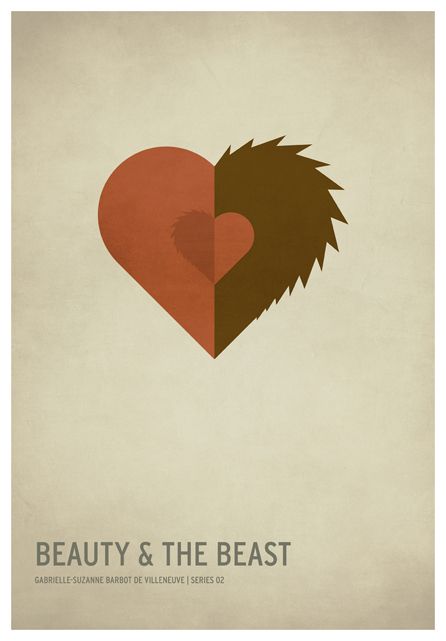
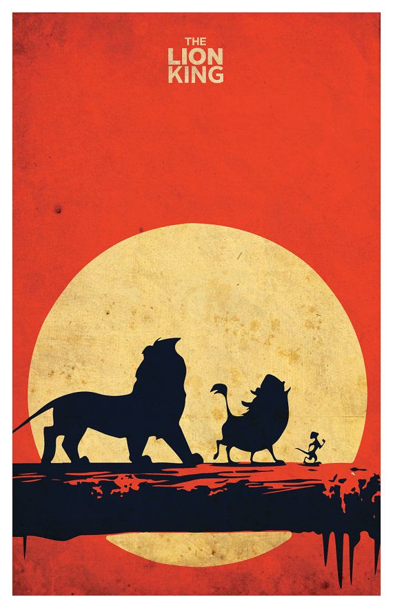
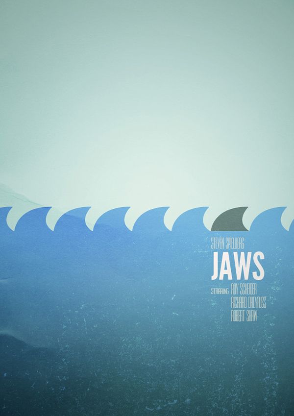
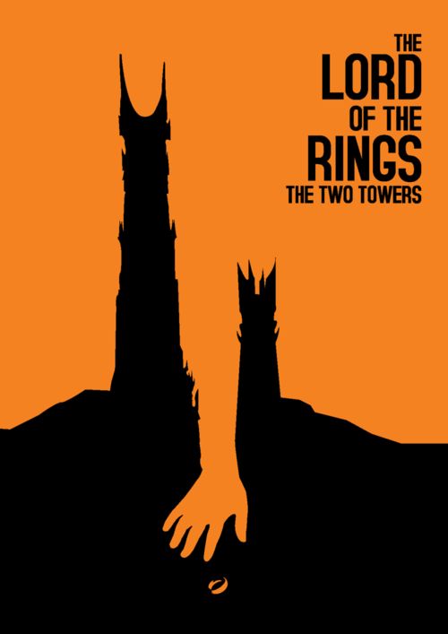
When we look at anything that is minimalistic, the first conclusion that we draw is that it must have been very easy to do. It is after all, a few words and artwork and that is all. Right? Actually, the truth is far from that and anything minimalistic can be difficult to pull off given that you want to convey a lot in so little. It is not like minimalist décor the right way to make your living space open and light, but the way of thinking could be on the same lines. The thing is it becomes important to say a lot without having to go overboard with the way you have expressed yourself in a few words and artwork items. The minimalist movement has taken root in the minds of many people given that today we have less space, less time and lesser resources to work with.
That is why when it comes to perfect patio ideas for you to potter about, you immediately think minimalistic. Many cultures relish the fact that they express a lot with very less. You can look at chilling Japanese style interior designs to see what we mean.
Here Are Some Of Our Thoughts And Pointers About How The Minimalistic Posters Given Here, Have Come About So That You Can Also Do Something Similar:
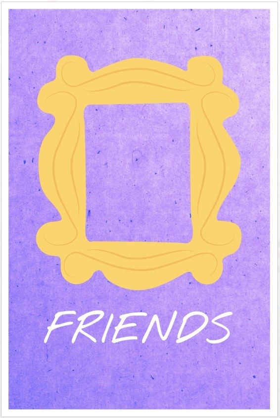
Think popular: One of the ways to make your minimalistic poster work well and make the subject obvious is to use elements that are popularly associated with the subject. Like for instance, if the poster is about the popular soap opera “friends” then the poster can use some popular elements from the sitcom.
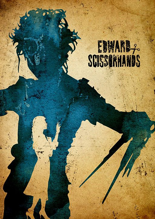
Combine elements: When you think of certain sitcoms, movies, cartoons and books, the main thing that comes to mind is some elements in them. For instance, the werewolf or vampire like the human/animal element are the main ones and these together can make a minimalistic poster tell you the complete story without too much embellishment.
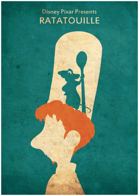
Outline characters: Some of the characters that we want to depict in posters are so well known that their outline is enough to make you understand. Take for instance any of the superheroes who are easily identifiable without anything being made obvious. This also applies to iconic movies like “ratatouille’ where the outline of the characters can make the message obvious.
Look in and out: Sometimes it makes it simple to just show the most obvious aspect of the movie as if it has been seen by someone sitting inside through a window or some other way. or the reverse can also be used and you can show a character sitting outside looking in to a scene that outright represents what you want to depict.
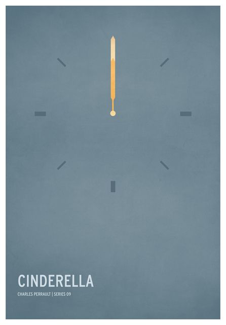
Minimal words: They pictures speak louder than words and this is never more obvious than when you look at these minimalistic posters. In most cases, these posters don’t need words; only the pictures and that too done in a minimalistic manner are enough. However, if you must add words to such minimalistic posters, then ensure that they are also minimal but one that carry a very high impact.
We want you to look at all the images that we have given here and also read what we have written and then add some thoughts of your own. Though the posters are minimalist, what they make you think is not at all minimalistic. There is so much these posters say and depict that you wonder at the way the artist’s mind works. Do share with us your thoughts on these minimalistic posters.


